“Do you have any thoughts about what you’d like your cover to look like?”
This is one of those questions most authors I’ve spoken to love to hear from their publishing team. I know I definitely do. It doesn’t happen with every book; sometimes your team have a really clear idea of what they think the cover should look like from the outset, or what kind of cover will make an impact in the current market, so while the author is generally consulted, they’re not necessarily asked for ideas at the initial stage of coming up with a cover concept. (This is fine! I’m not a designer, and appreciate that my aesthetic ideas won’t always hit. That said, I do usually have ideas…)
When my wonderful editor Clare Vaughn at HarperTeen emailed me to ask for my ideas for The Devouring Light’s cover, I was thrilled. I knew I wanted it to be dark and creepy, so I started scrolling through images of published YA horror covers, gathering inspiration.
These were some of the notes I sent Clare to share with cover designer Molly Fehr (IG: @mollyfehr) and art director Joel Tippie (IG: @jdrift): ‘I feel like the house should be on there, preferably in a dark, misty, swampy setting with spindly trees, and a single light shining from an upstairs window.’
Here are the fantastic first cover concepts Molly and Joel came up with:
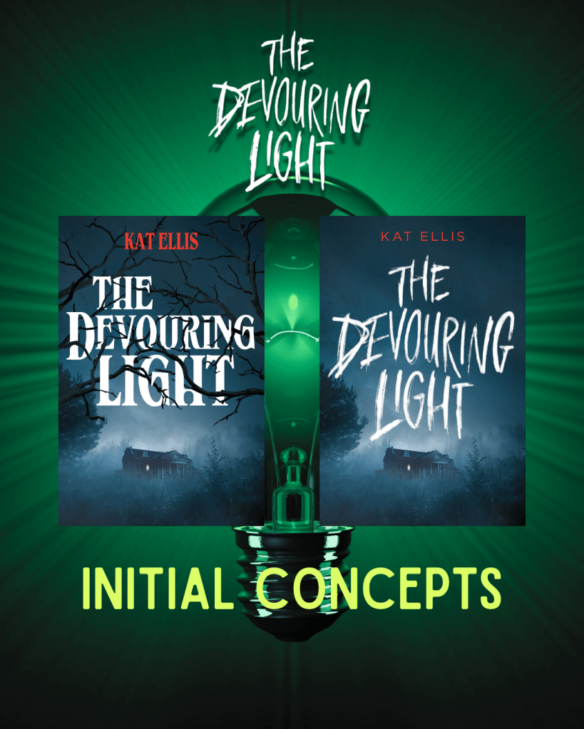
Already stunning, right? I LOVED the twisty branches running through the title on the first concept, but preferred the fonts used in pic 2, which definitely felt more YA to me, and more in keeping with The Devouring Light’s overall vibe. Something about the colours and background image made me think more of an adult thriller set in the countryside rather than a swampy YA horror, but I thought these were definitely heading in a great direction. I asked if the house itself could be a little more gothic, and if Molly and Joel could amp up the swampy feel to really project the creepy setting of the story. And they absolutely did!
After choosing a basic house design from several options they sent me, I added some notes.
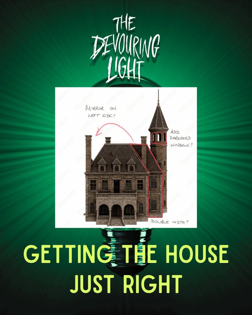
I was over the moon with what the design team came back with. They sent over 4 versions with different colour options and slight variations of the house.

It was so hard to choose a favourite! I talked it over with my agent, then went back to Clare to say that we both loved the colours of option 4, but with the house used in 1&3 — and maybe a smidge more green mist?
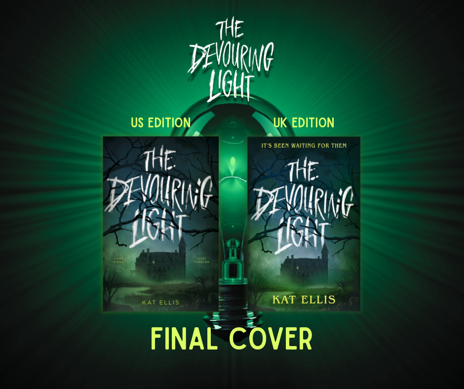
When the final cover came back, she was GLORIOUS.
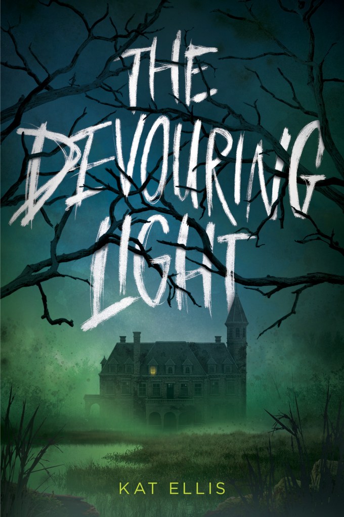
I can’t adequately say how much I love this cover! Huge, huge thanks to Molly, Joel and Clare for making it so gorgeously creepy and perfect, and for letting me pitch in my ideas along the way. I am one very happy author! And the UK publishing team loved it too, deciding to use the same cover — with a few little tweaks.
Here are the US & UK versions of the cover side-by-side – can you spot the differences?